SIDDHARTH ANAND
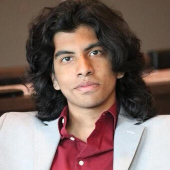
I am a game producer, designer, and developer with 5+ years of experience making games. I have led teams of up to 100 developers, working in projects that range from indie to AAA. The teams I have led range from design management, audio design, production management, and more. While I am primarily a producer, I have extensive experience in game programming, game design, tools programming, audio design, narrative design, and systems design. I am fluent in C#, Python, GDScript, and many other languages, and I have extensive experience in Unity, Unreal Engine 5, Godot, and GameMaker.
MY GAMES
Pokémon Bushido
A top-down Pokémon fangame RPG, renovating turn-based combat with mid-battle samurai effects and dialogue, heavily inspired by Japanese culture.Status: Released
Role: Co-Lead Developer
Engine: RPG Maker XP
Team Size: 4
Time: Mar. 2021
Port and Plunder
A physics-based party game where players traverse through a pirate map, gathering and strategically stacking treasure onto a rocking ship.Status: Released
Role: Team Manager
Medium: Tabletop
Team Size: 22
Time: Dec. 2023
MUSO
An old-school RPG where you take control of a young high-school freshman, named "Atabi" on his journey to discover the secrets of the universe with the help of an unusual gang of friends.Status: Demo Released
Role: Programmer
Engine: Godot
Team Size: ~20
Time: EOY 2025
Pokémon Lycoris
Explore the Ambrosa Region in this top-down pixel-art RPG, with revolutionized turn-based combat, overworld combat, and skill tree mechanics.Status: In Development
Role: Lead Developer & Producer
Engine: RPG Maker XP
Team Size: ~20
Time: Summer 2025
4PM
A point-and-click game that follows a depressed man. His life is abstracted in wacky and zany visuals that take him through mysteries and horrors beyond comprehension.Status: Released
Role: Developer
Engine: GameMaker
Team Size: 3
Time: May 2024
RELATED PROJECTS
Eevee Expo
A website that hosts indie games and fangames, coordinates game jams and other game-dev events, and creates an annual video showcase of all upcoming projects.
Project Type: Forum Site & Video Exhibition
Role: Moderator, Producer, Host
Time: March 2022 - Present
Slice of Life
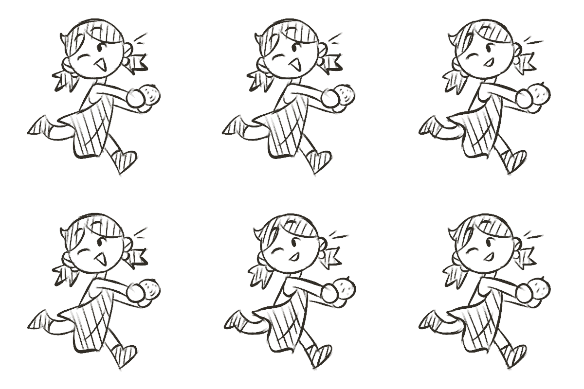
A short film submitted for NYU's T48 Film Festival. The film follows a girl on Chinese New Year, who contemplates her future as she peels mandarins in the back of her family’s restaurant.
Project Type: Animated Short Film
Role: Producer, Editor, Sound Designer
Time: March 2024
About ME
My name is Siddharth Anand, a game producer, designer, and developer. I am currently pursuing both a BFA in Game Design and a BA in Computer Science at New York University. I have 5+ years of development and production experience, dating back to when I was 13 years old.
In my time working on games, I've produced games on both the indie and AAA level. I've led teams of ~100 developers, allowing me to gain fluency in project management, level design, narrative design, screen scoring, combat design, and all other aspects of game design and development.
As well as being heavily successful with my professors at the NYU Game Center, I was also an IndieCade Intern and an IGDA-F 2024 Alumni. These programs have taught me a lot and have given me numerous skills to make me a better developer and a better-trained professional. Beyond this, I have demonstrated leaderships on-campus through my position as Operations Manager of the Tisch Undergraduate Student Council and my position as Events Coordinator of the NYU Piano Society.
My knowledge of both game design and games overall knows no bounds. I am able to thrive in any team I am introduced to, and I am committed to seeing the success of my projects. I have been thoroughly trained and have been considered a low-risk, high-reward team member in any given scenario.
Email: [email protected]
Pokemon Lycoris
NOTE: This is not a mod to an existing game. This is a standalone game, built from the ground up.
Pokemon Lycoris is a non-profit indie RPG project based on the Pokémon universe, made in RPG Maker XP using the Pokemon Essentials devkit and Ruby. This project has taught me to work within the constraints of an existing IP. Pokemon Lycoris has undergone multiple iterations to now end up in its current state. The project is still in development and expected to release in 2025.Within our team, I am the lead developer of the project. I oversee all of the design and production of the game. Additionally, I am the lead programmer and lead sound composer for the project. I am also in charge of managing each individual team director.
MY RESPONSIBILITIES
★ Designed and approved the overarching narrative of the game.
★ Oversaw multiple development teams, providing direction, insight, and pipeline support.
★ Programmed combat encounters, both in turn-based styles and in overworld styles.
★ Directed, choreographed, and programmed cinematic cutscenes to emotively convey the game's story beats.
★ Coordinated with art directors to develop intricate monster and character designs.
★ Wrote worldbuilding elements to enhance the immersion provided by the game's locations.
★ Designed and programmed UI/UX elements of the game, including the battle scene, title screen, etc.
★ Utilized tilesets to create in-game maps, exercising level design skills to make routes and cities for optimal playability.
PRE-PRODUCTION
PLANNING
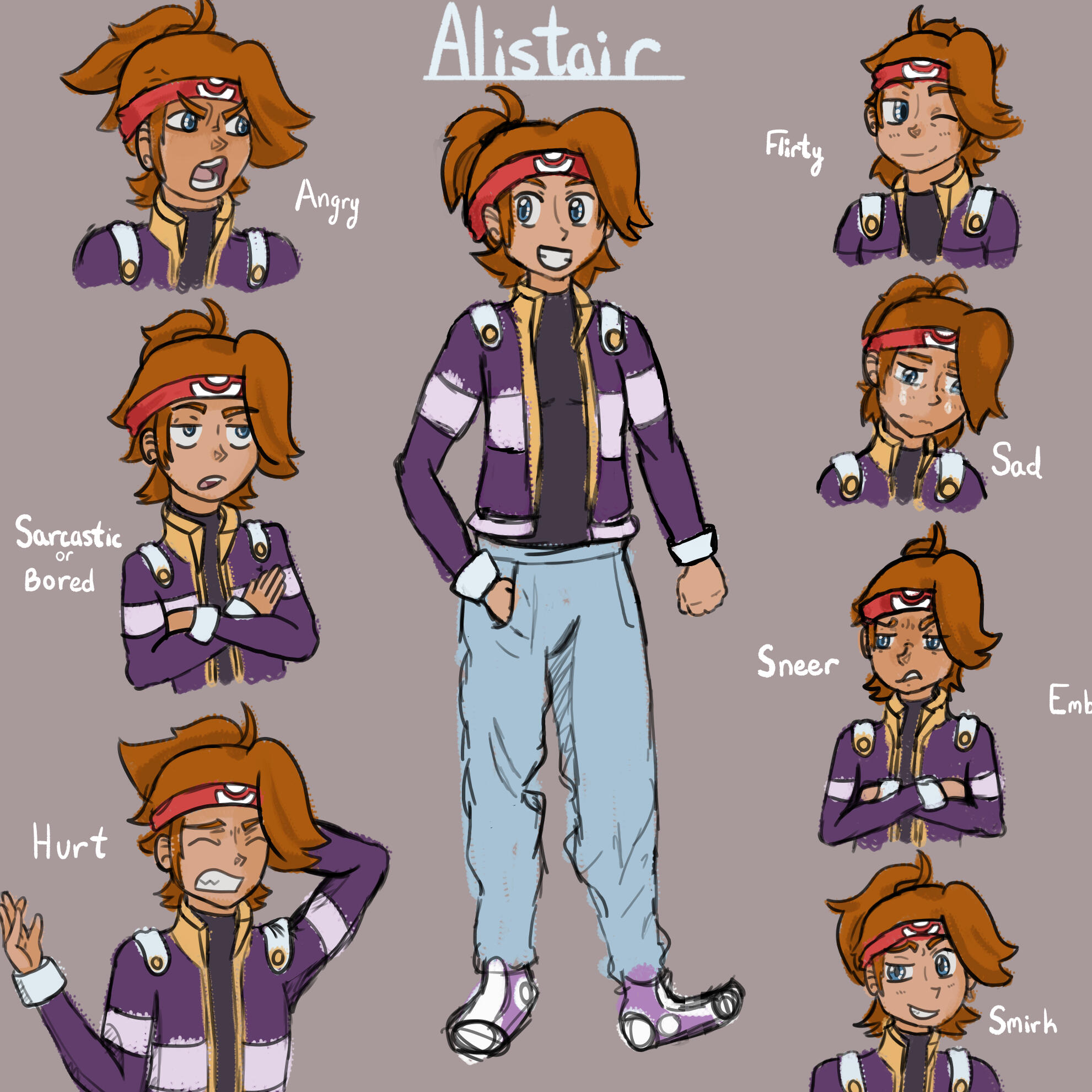
One of the first things we did when starting development was designing our main protagonist. Traditional RPGs struggle to showcase the emotions and expressions of their characters, and we aimed to change that.
The team came in knowing that we wanted to create a very compelling story, and it would feel unsettling to have that kind of narrative without proper expression.
Thus, we decided to draw expression sheets for all of our characters, and we began brainstorming various ways to display these expressions within our dialogue UI.
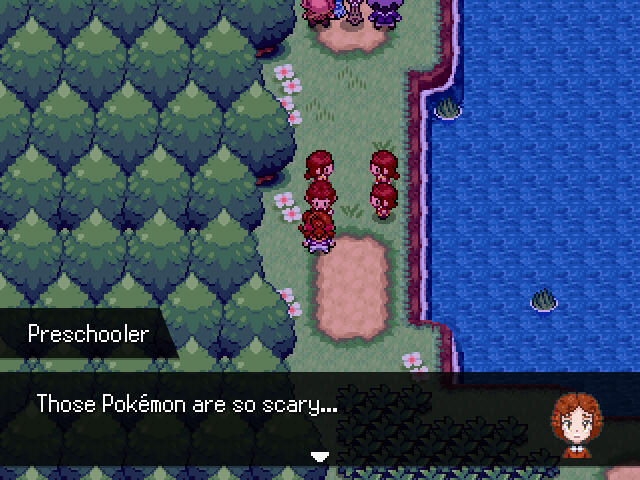
My solution to this problem was to have a dialogue UI that uses separate sprites to display character expressions next to their dialogue. This would make it easily visible for players reading dialogue to see exactly how a character feels in that moment, further highlighting the impact of our story (seen below).
HIGHLIGHTS
Iterative UI/UX Design
The UI design of this project was extremely important, as there's a lot of information for the player to keep track of. The UI shown on the left is the player's Party UI.
When making this UI, we wanted to give players easy access to basic information, such as the HP, Level, and Status of their party members. Rather than having to go into the Party UI and open a sub-UI to access this information, our design allowed for the player to only have to press one button to access it.
We had multiple iterations of the party UI, as the main issue was finding a way to communicate controls to the player. In the final iteration, shown in the video, this information is communicated effectively.
A lot of time went into game feel for this UI as well; as the elements move, they feel smooth and cohesive, with minimal jitter or lag. The programming of this UI took a lot of heavy lifting.
WIP Version:
Final Version:
SOUND DESIGN ITERATIONS
As the lead composer of the game, I went through multiple iterations of tracks, experimenting with mixes, instruments, and overall sound designs to get the perfect feel for the location.
The two audio tracks linked on the left are two iterations of the same song. This song is the BGM for a location called "Eternity Lake". The track is meant to be very ethereal and wispy, to convey the mystical powers of the lake.
The improvements on the final version (the bottommost audio file) are evident, and both of these tracks demonstrate the iterations that both I and our sound team went through to perfect the audio for this game.
NOTE: Audio files may take a second to load in, but they do work.
Level Design
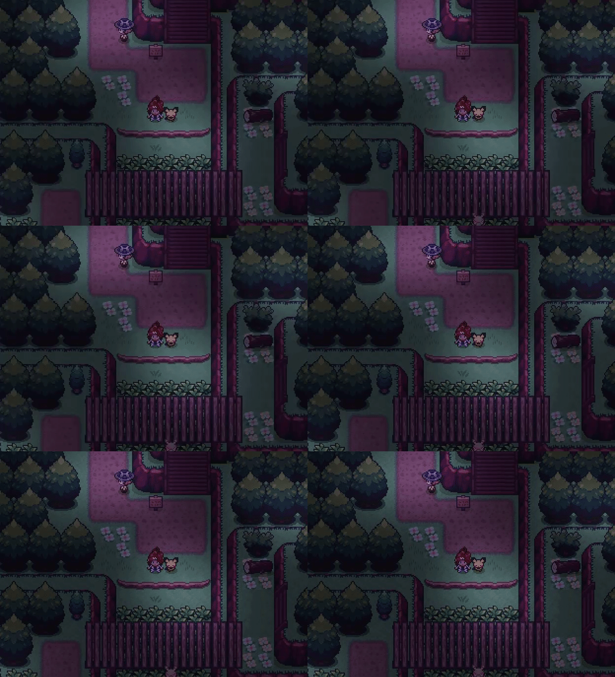
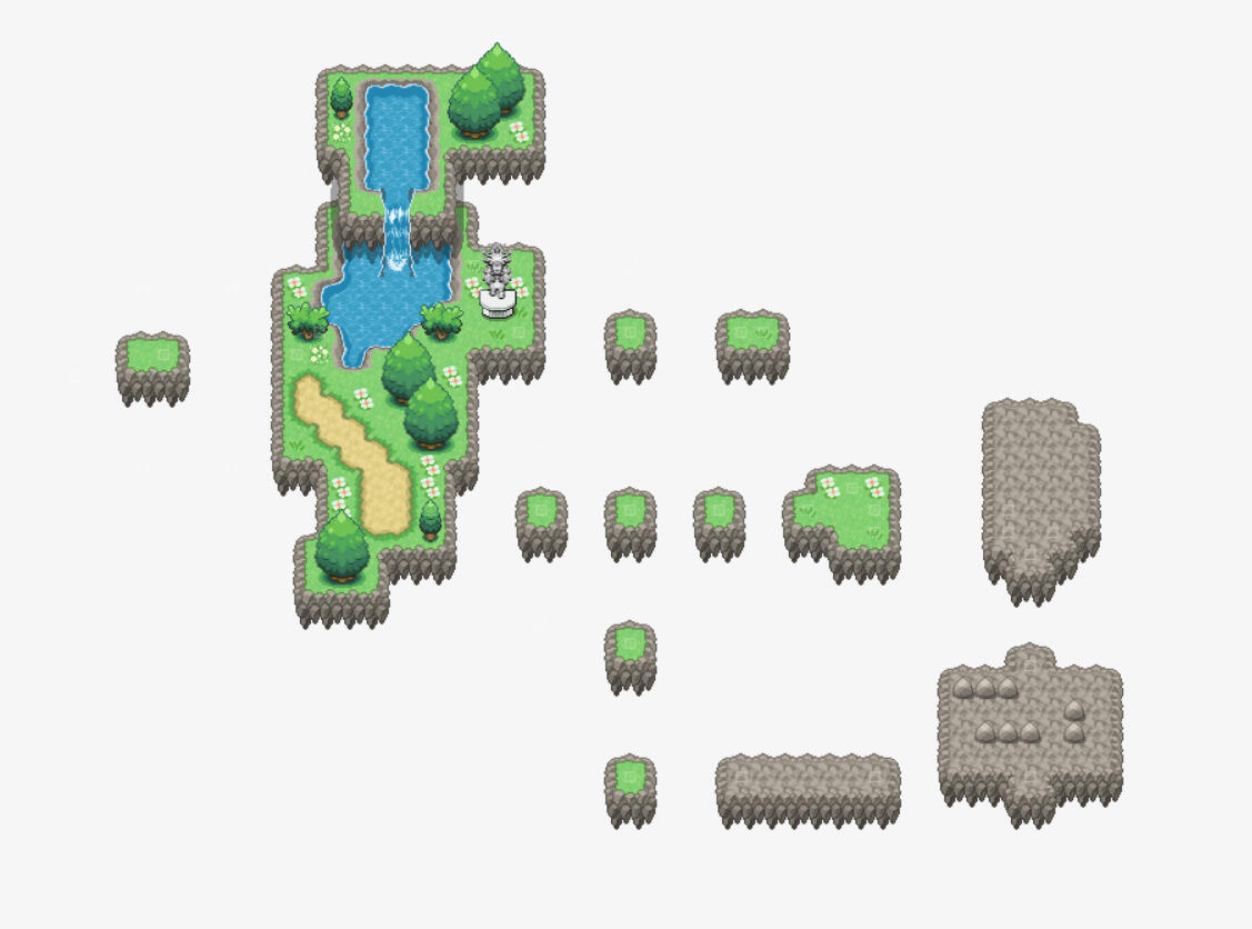
In our project, we immediately knew that we wanted to create a more engaging overworld experience for the players, rather than constraining all of the core gameplay to the turn-based battles. To do this, we attempted to implement a variety of puzzles, one of which included the player jumping across floating islands and stepping on crumbling rocks to unveil treasures.
One problem we encountered was that there were concerns players would not know how to jump between islands. Our initial draft of the island map was unintuitive and did not allow players to experiment with the jumping mechanic before putting them in the puzzles.
Our final iteration (seen attached), heavily improved this problem. My solution as a level designer was to spawn the player on a small island, the leftmost island on the map, to effectively force the player to jump by hitting the edge of the island. Then, once the player realizes they have the ability to jump, they can jump on multiple islands and experiment, before going into the stone puzzles.
In playtesting, this new level design proved effective, as players were more aware of their movement possibilities, and they had more control and confidence when solving the stone puzzles.
Project Management
Lycoris was my first time managing a large team of this caliber. Therefore, I had to learn how to utilize various healthy project management practices to keep the game afloat. Examples of this can be seen on the included pictures, which depict the spreadsheets that we use to allocate work between composers and track the progress of each musician, as well as the spreadsheets we use to organize every single piece of data about our monsters, for use in balancing and programming.
Additionally, our team utilized multiple Miro and Notion boards, linked in the Game Design Documents above, for which I was in charge of managing and organizing. I gained extensive experience with these tools, and I was able to utilize these tools in order to properly manage our team, onboard new members, and maintain the progress of the game overall.

NOTE: This is not a mod to an existing game. This is a standalone game, built from the ground up.
This is a non-profit fangame project based on the Pokémon universe, made using the Pokemon Essentials devkit and Ruby. This project was made in collaboration with Thundaga, TristantineTheGreat, and HauntedArtStudio, for the Relic Castle Winter Jam #2.I was the co-lead developer of the project. In Pokemon Bushido, players play as a Kenshi who is the child of the legendary Royal Samurai. As the Akui Clan attacks the region, you are tasked with saving your father, bringing honor to your family name, and learning more about the secret sword techniques that enhance you and your Pokemon.This project was one of three that were awarded a Judge Spotlight among 30+ entries, and the game itself was made in 6 weeks.
MY RESPONSIBILITIES
★ Assisted in the design of the game's narrative and core gameplay loop.
★ Managed the art direction of the project, providing a scope and prompts for the artists on our team.
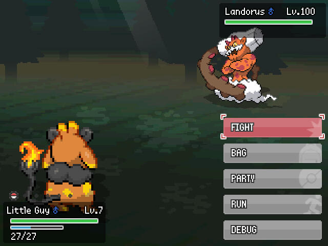
★ Programmed a re-invented turn-based system in which enemies use mid-battle dialogue to alter the battle flow.
★ Created various overworld maps and puzzles under the thematic influence of the feudal Japanese era, to match the samurai theming of the game.
★ Evented multiple in-game cutscenes using RPG Maker's framework, while also writing custom scripts for functionality.
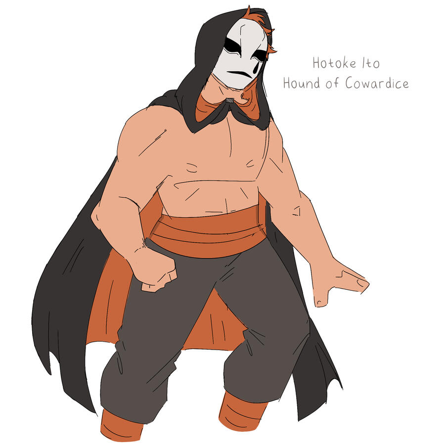
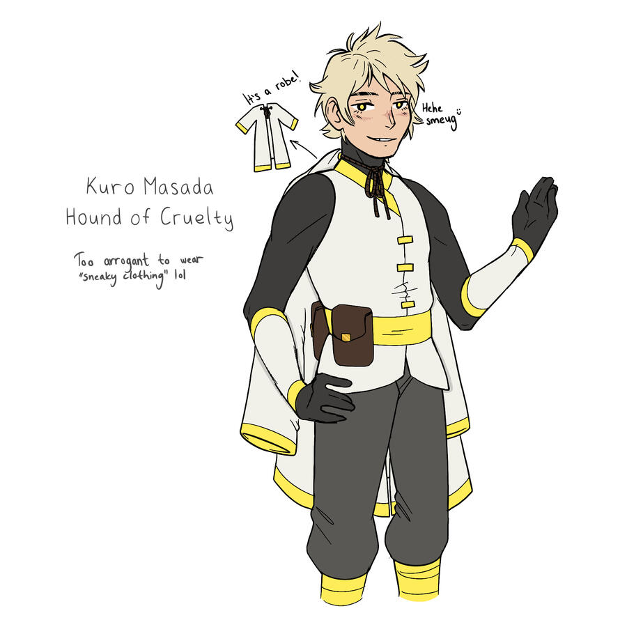
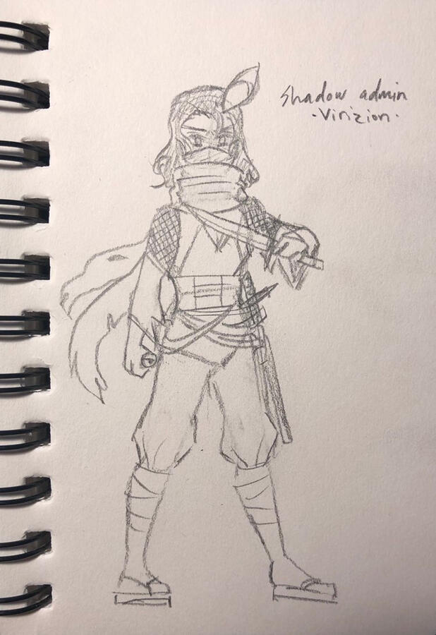
★ Created and developed characters, complete with full story arcs throughout the game.
★ Altered and re-designed various UI/UX elements to enhance the immersion of the battle system, beyond vague backgrounds and uninteresting elements.
★ Demonstrated knowledge in color theory and other artistic practices by compiling tilesets, character models, and other assets for cohesion.
Pre-Production
Brainstorming
Our base design pillar was the fact that we wanted this game to take heavy inspiration from feudal Japanese aesthetics. Based on this, we began to design some basic characters that we knew would be involved in the narrative, such as the rival characters and Champion.
We were also heavily inspired by existing games like Pokemon Conquest and Fire Emblem, so a lot of our design philosophy was inspired by those games. For example, we really enjoyed the idea of having clans, as was present in Pokemon Conquest, so we incorporated a similar theme into Pokemon Bushido.
After settling on a theme, we began planning our narrative. We made the decision to have our story revolve around three major clans, and we began extensively planning the narratives behind these clans (see Game Design Document). Therefore, we planned our story in three core arcs, which helped structure our development a lot more.
Pokemon Bushido Design Doc
Style iterations
One main difficulty we faced when making Pokemon Bushido was settling on a concrete style. While we knew we wanted to base our game on Japanese aesthetics, we didn't know how to properly convey our theming while also keeping the maps and levels akin to a Pokemon game. I took primary responsibility on making various iterations of what our game could look like.
Initially, we tried using very standard tilesets, with vaguely feudal assets, but ultimately, we decided to fully lean into the Japanese aesthetic, with sakura trees, bridges, shrines, etc.
In implementing this style, we heavily considered the battling aspect of samurais, and as such, we wanted to make the battlegrounds feel very sacred. The final image on the right depicts this, complete with tombstones and a wooden stage.
Highlights
RPG DESIGN SKILLS
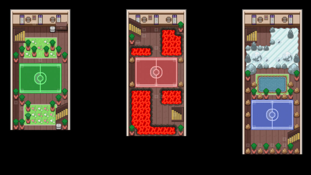
When designing Pokemon Bushido, I had to design within the constraints of the game jam. The game was designed in 6 weeks, and therefore, a lot of our design ideas had to be hyphenated and shortened. I knew that, because of our shortened development timeline, I would have to integrate a smaller gameplay loop that was still fun for players. Ultimately, I ended up focusing on utilizing dojos as "chapters" or segments in the gameplay. Each chapter follows the same loop: Explore the city, defeat the villains, and challenge the dojo.Designing this loop to feel fun and inventive, despite having the same loop three times in the game, taught me a lot about game design and how to design game loops for certain constraints. Additionally, I demonstrated clear design philosophies through each dojo, implementing new challenges, playtesting these challenges, and altering the puzzles and combat based on those playtesting notes.
BALANCE & COMBAT DESIGN
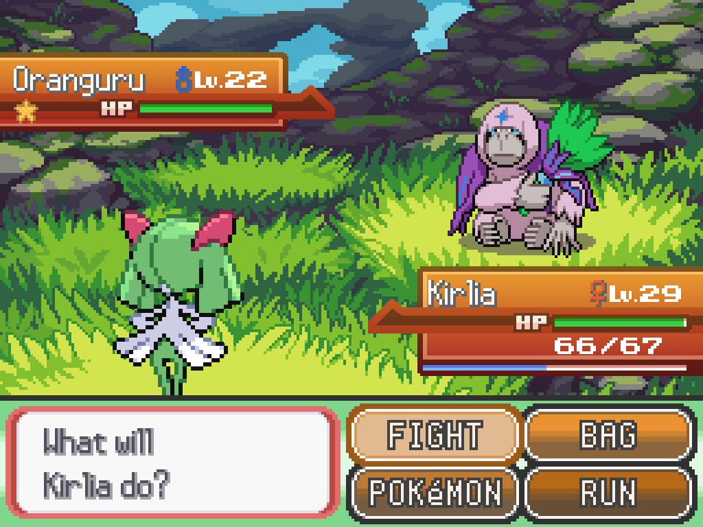
One thing that I heavily focused on when creating Bushido was the impact of combat in the game's narrative. In order to demonstrate a split between "honor" and "dishonor" in battle, I coded in mid-battle dialogue mechanics for enemy trainers to have unfair advantages. For example, enemies could throw spikes on the battlefield or poison the player, as they were "cheating" and playing unfair.In order to properly introduce this mechanic, I had to balance the game properly and ensure that the enemies wouldn't be too hard for the player to handle. This was done in a variety of ways. Primarily, each battle was intricately planned and thought out based on the player's available strategies. Based on what Pokemon the player could access, what healing items they had available, and the player's level of expertise, I carefully curated each trainer to ensure a slight, but manageable difficulty curve.
This clip demonstrates an example of battle balancing we did, in which you take a quiz, and receive stat boosts upon answer questions correctly.
NARRATIVE DESIGN
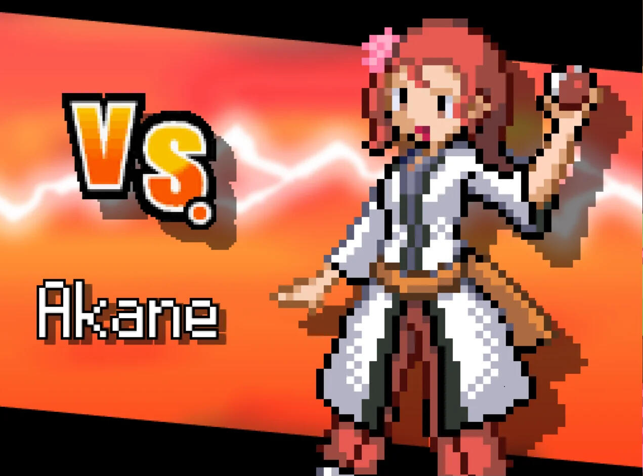
One major part of Pokemon Bushido's design process was the narrative. From the beginning, we had clear themes that we wanted to convey to the player: honor above dishonor, family connections, and perseverance. We intricately designed our characters and plot points to ensure that these themes would effectively come across.Linked below is the character sheet document for each character in Pokemon Bushido. These documents demonstrate a clear understanding of character design, game writing, and narrative experience.
MAP DESIGN
The aesthetics of Pokemon Bushido were a central focus of the game. We spent a great deal of time compending tilesets, gathering references, and planning out our world in order to create a cohesive, feudal aesthetic for the players. My map design in Pokemon Bushido demonstrates an understanding of game design, player philosophy, and artistic cohesion.For example, in order to emphasize the feudal Japan time period, a lot of traditional Pokemon elements were subverted. I chose to replace traditional Pokemon Centers with hot springs, traditional PCs with bird carriers, and traditional item stores with village markets. These quality of life features being reskinned allows the player to fully immerse themselves in the time period of the game, with no room for inconsistency.The architectural design of Pokemon Bushido also demonstrates our deep research into Edo period architecture and samurai-time culture.
Playthroughs
Post-Mortem
Successes
★ We were very successful in incorporating the feudal Japanese aesthetic that we planned for. Many players noted the soundtrack, environment, and characters as their favorite aspects of the game.
★Given the timeframe of this jam, we were able to release an extremely successful product. We didn't have to cut down on any major ideas from our initial pitch, and we were able to execute our vision well.
★ The gameplay felt very engaged and was well-designed, and players never felt bored. Through playtesting, we found a consistent sense of engagement and interest from users.
★ We were successful in creating a cohesive game feel. The game felt fun to play, and players were consistently immersed in building their own Pokemon teams and progressing through the story.
Challenges
★ Given the time limitations and team-size constraints, we had to utilize a lot of public assets and utilities, which limited to extent to which we could fully express our vision. We were limited to what was available to us.
★ Monster-catching games tend to follow a very standard formula, and we had to work extremely hard to design a game that would break that formula. We ultimately did this through the mid-battle ninja effects, that varied and altered the turn-based combat.
★ Team activity dwindled occasionally, limiting our ability to create art assets and designs in time. While our programming and design members were consistently active, it was more difficult to produce art for our characters and monster designs.
★ Towards the end of the jam, there was definitely a sense of crunch that was unfavorable. This likely was due to slight overscoping on the design team's end, which caused various challenges in production phases.
Improvements
★ Limiting the scope of the game and focusing on a more qualitative experience, rather than creating a full-length game, would have been beneficial.
★ The mid-battle ninja effects were often seen as unfair, providing enemy trainers with advantage. This system could be reworked to benefit both the player and enemies.
★ Our narrative could have been improved. The final twist at the end was slightly shoehorned, and had minimal emotional impact. While some players enjoyed it, others noted that it could've been improved with better foreshadowing.
★ There were some minor stylistic inconsistencies. For example, the tree tiles we used were lineless, with a specific shading style, but our buildings had hard outlines and different shading styles. The shadow sprites were also angled differently, which made certain environments feel inconsistent.

MUSO is a fantasy RPG game made in Godot, inspired by the Earthbound series of games. In the game, you take control of a young high-school freshman, named Atabi, on his journey to discover the secrets of the universe, with the help of his childhood friends.
I am a programmer on this project. Specifically, I am responsible for coding the internal back-end systems that will be used by designers and developers to create the front-end experience of the game. These systems include level editors, dialogue systems, map debuggers, etc. This project has helped me demonstrate extreme proficiency in C# and GDScript.
MUSO was initially developed in RPG Maker MV, but due to some internal issues, the team decided to make the transition to Godot, allowing for more functionality and in-engine autonomy. Therefore, the bulk of my work has been transferring the existing work in RPG Maker MV to the new Godot project. Our demo, linked above, is developed in RPG Maker MV, and may not fully demonstrate the capabilities of the new game's iteration. Additionally, our most recent trailer is embedded above.
MY RESPONSIBILITIES
★ Developed interal systems for designers and developers to utilize in their respective fields.
★ Worked directly under a project lead to fulfill their vision for various programming tasks.
★ Worked with QA testers and programmers to solve various bugs in-game throughout the development process.
★ Demonstrated mastery of source control through GitHub, using external tools like Visual Studio and GitLab to resolve merge conflicts and allow for functional branches of the project.
★ Migrated our project from RPG Maker MV directly to Godot, using knowledge of Ruby, GDScript, and C#.
★ Worked on building the webpage for the project, utilizing custom HTML and CSS scripts in order to add functionality various browser widgets and aesthetic details.
★ Assisted in the game's documentation process, using G-Suite and Adobe Creative Cloud to document the art references, programming goals, and game design elements of the project.
★ Acted as a representative for MUSO in various communities, assisting in MUSO's involvement with various indie events, trailer showcases, and more.

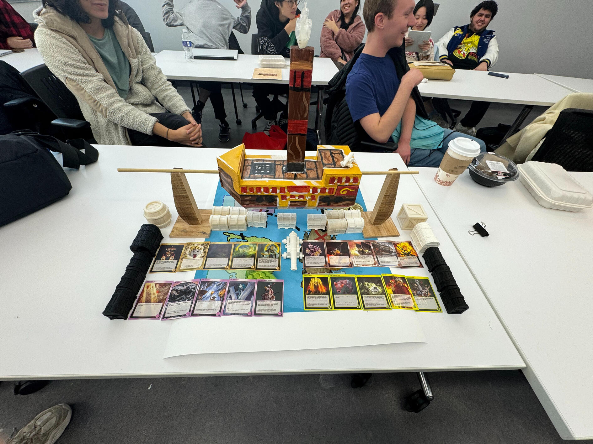
Port and Plunder is a physics-based tabletop party game, made using 3D printing and physical production means. where players travel through a map and attempt to stack pieces onto a rocking 3D ship, without toppling the ship over. The game is now complete and available to play at the NYU Game Center.
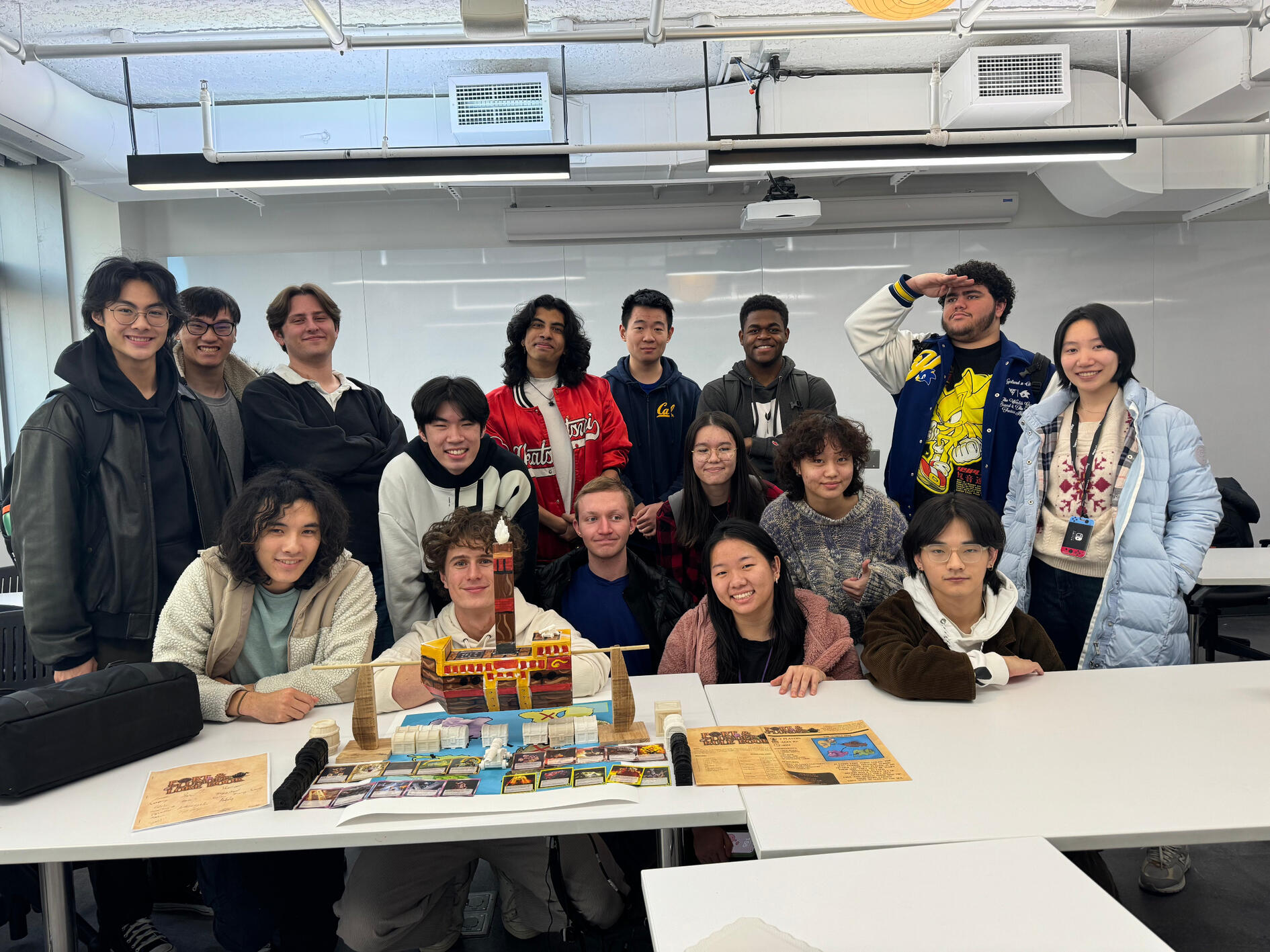
This project was made as a final project for the Intro to Game Design class at the NYU Game Center. Traditionally, the class has students work in small groups to create games, which are shown off in presentations. However, I petitioned to have a final project where the entire class worked together on one big project. The end result was Port and Plunder.
I was the head director for this game, as assigned by my professor Laura Reyes. I oversaw all four sub-teams (art, narrative, production, and mechanics) and ensured the success of each team. Each sub-team had their own respective leads, who reported directly to me.
Attached to the link above are all of our game design documents through the process of making this game. Ultimately, our professor deemed the project a success and gave us full marks, while also providing us with comprehensive feedback. The project gave me experience in leadership positions for game projects, allowing me to be a project manager, department manager, and game designer all at once. My process and timeline is described more comprehensively below.
MY RESPONSIBILITIES
★ Led and directed the production and development of the game.
★ Oversaw 4 department leads, in fields of Art, Mechanics, Production, and Narrative. Consistently took charge of the four department heads, coordinating their development.
★ Served as a liason between the four departments and our teacher, who assumed the role of a publisher in this project. De-escalated conflicts and alleviated confusion within the teams.
★ Developed the core idea around the game, based on an initial pitch from a team member, to better fit the constraints of our budget, time, and assignment.
★ Utilized organizational tools like G-Suite and Trello to ensure smooth progression within each of the 4 main teams.
★ Provided assistance towards the narrative direction and art direction, making necessary adjustments to ensure that no teams were overlapping.
★ Took charge as our team's primary QA and playtester, developing multiple iterations of the game based on player feedback and advice.
★ Acted as a representative of the project to the NYU Game Center, advocating for the eventual publishing and housing of our game in the NYU Game Center Library.
Pre-production
TEAM MANAGEMENT
Before beginning the physical production of the game, it was important for me to coordinate with each individual department and ensure that we were all on the same page. To do this, I organized a Trello board in which department leads could assign tasks to others. This made our actual production process run a lot smoother.
Additionally, I held premilinary meetings with each department lead, to understand what their vision was and help unify everyone's thoughts. This process taught me a lot about the importance of pre-planning when working in large groups, and it ultimately paid off immensely.Taking on the role of a general manager was also rather difficult, but I had to accustom myself to the team to make it successful. I introduced myself individually to every team member, ensuring that they knew who I was and understood that I was a resource they could reach out to. This mutual trust and cooperation made the project run a lot smoother.
PROTOTYPING
Considering the physical nature of the game, it was necessary to prototype models of our ideas before proceeding, just to make sure our concepts were feasible with our given materials and budget constraints.
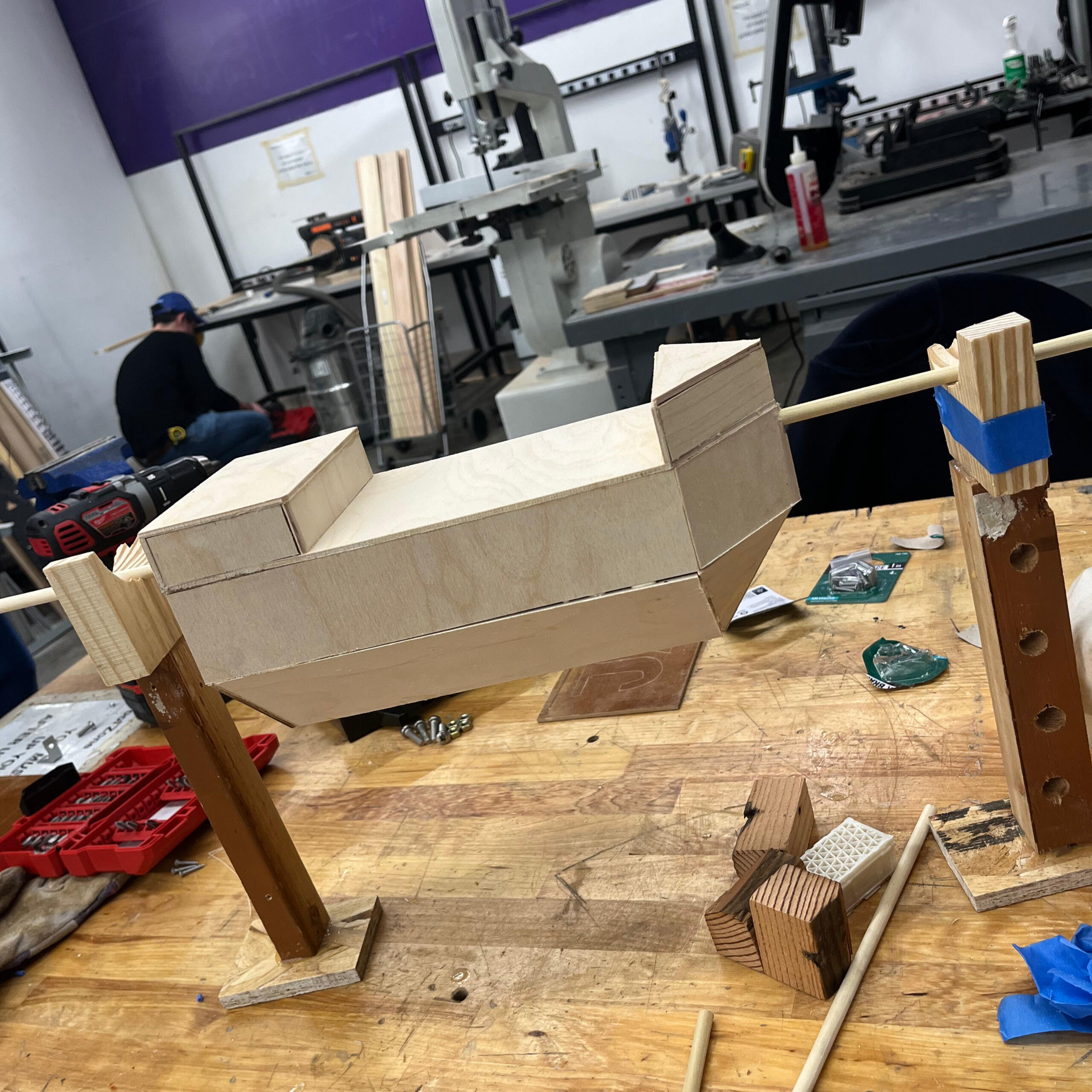
The picture to the side demonstrates an early prototype for the main game piece; the rocking ship. We used very rudimentary items, like scrap pieces of wood and painter's tape, to ensure that the physics of our planned boat model would actually work. Luckily, our prototype was successful, which meant that we would be able to successfully proceed with more polished renditions of our ship and game pieces.
The only adjustments we had to make were slight edits to how the ship was being held. Because of the wooden material, we had to edit the shaping of the stands to support more weight without the cracks. We iterated on this prototype to make a sturdier ship for our final release.
Highlights
3D Modelling
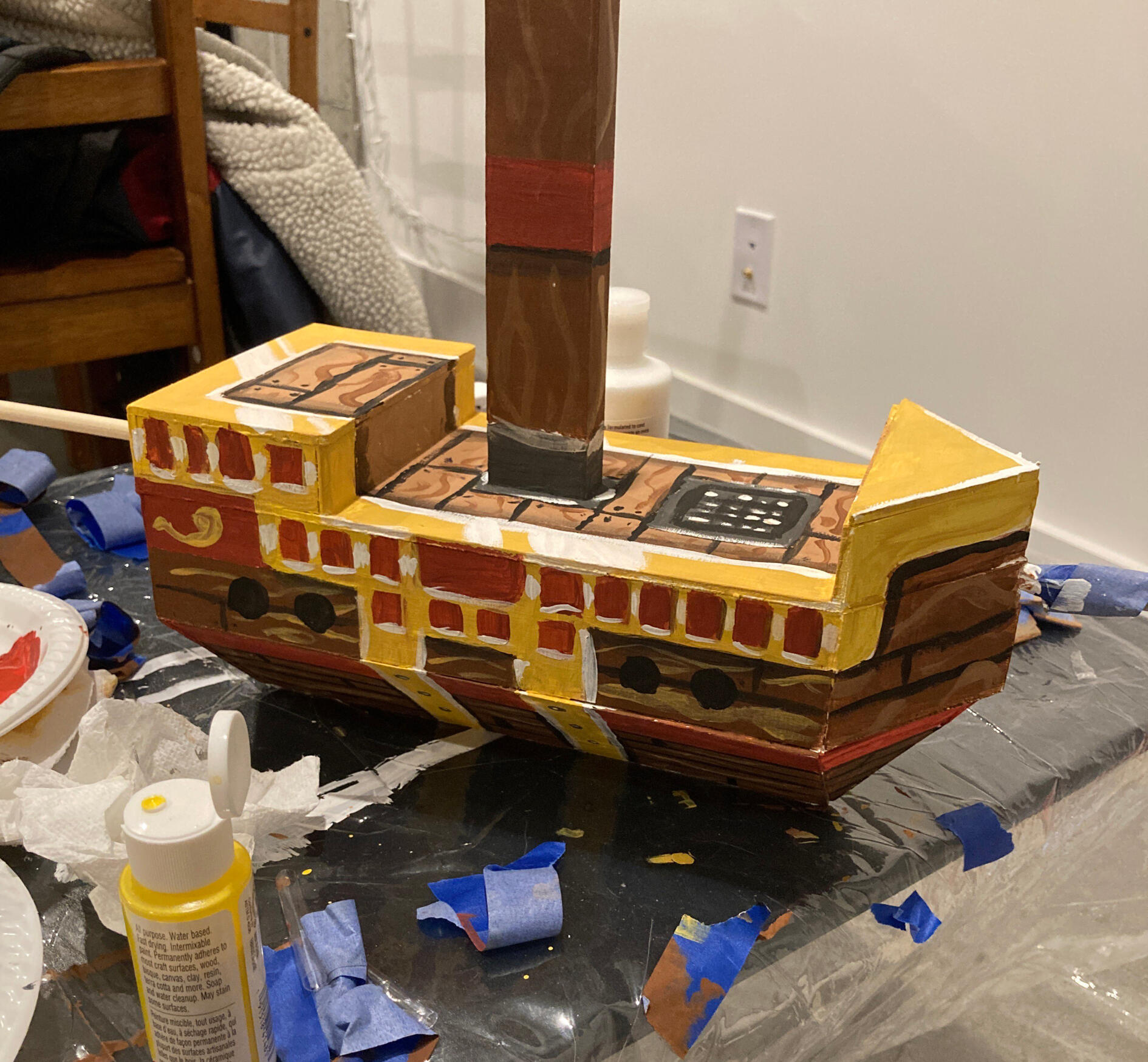
One of the biggest undertakings of this entire project was 3D modelling. It was an experience that was new to all of us, and therefore, we had to experiment a lot with different software and equipment. We had to sculpt the various game pieces, like the chests and boxes, as well as the ship.
Ultimately, the 3D models were a massive success. Not only were the models themselves very accurate and fun, but the weight and height of the models impacted the gameplay perfectly. Due to the hollow resin material we used, we were able to balance the game's mechanics accordingly, where players would be able to place X amount of chests or blocks on the ship without too much difficulty.
The picture to the left demonstrates an early draft of our prefabs.
ART DIRECTION
When working with multiple artists, it became difficult to achieve a distinct, yet cohesive art style for the game. While there was already a department lead for the artists, I took it upon myself to establish the game's overall art direction. I took inspiration from games like Sea of Thieves and media like Pirates of the Carribean to provide a runic feel to our cards, map, and rulebook.
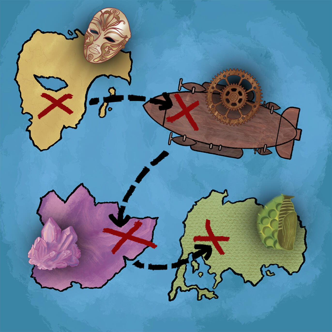
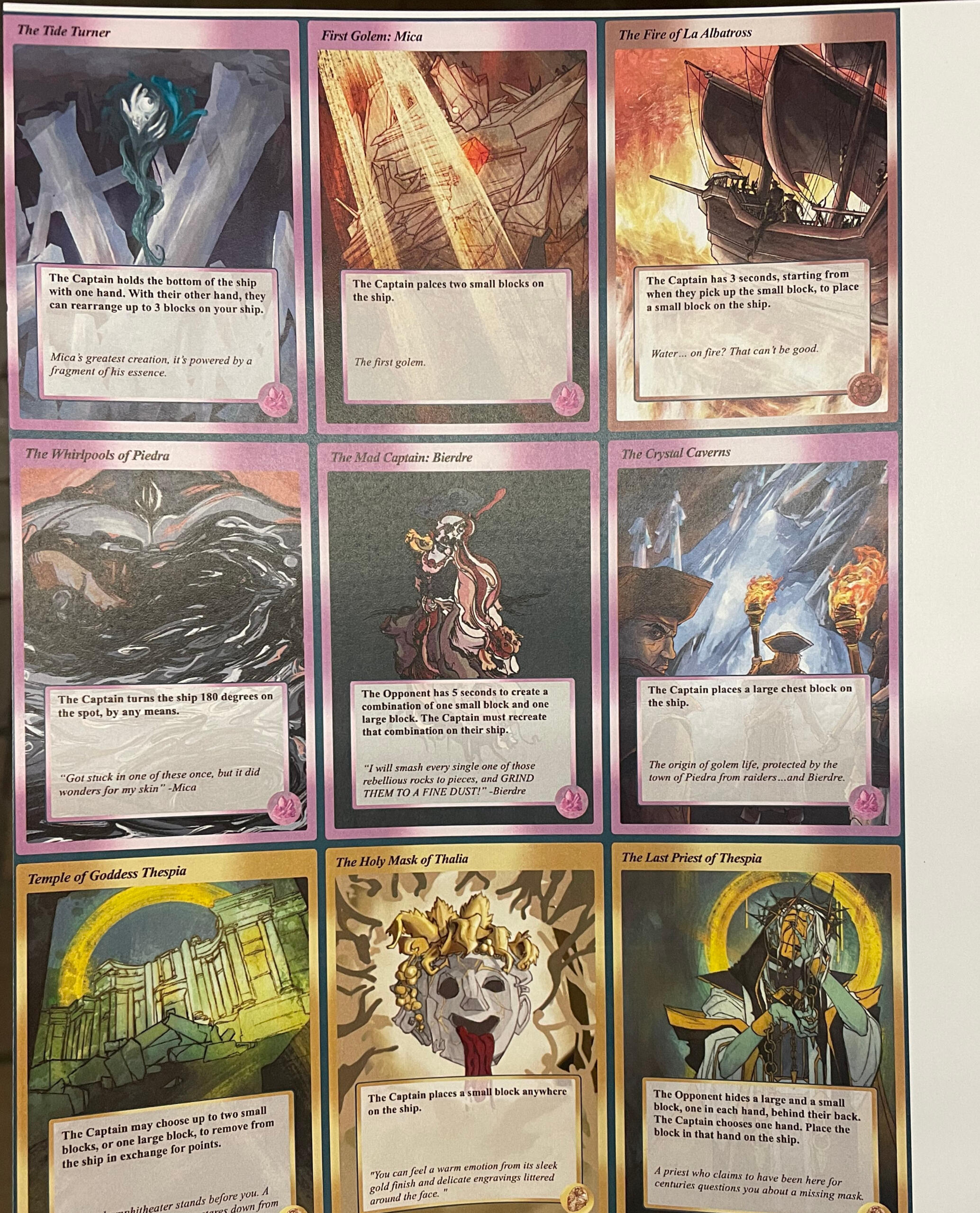
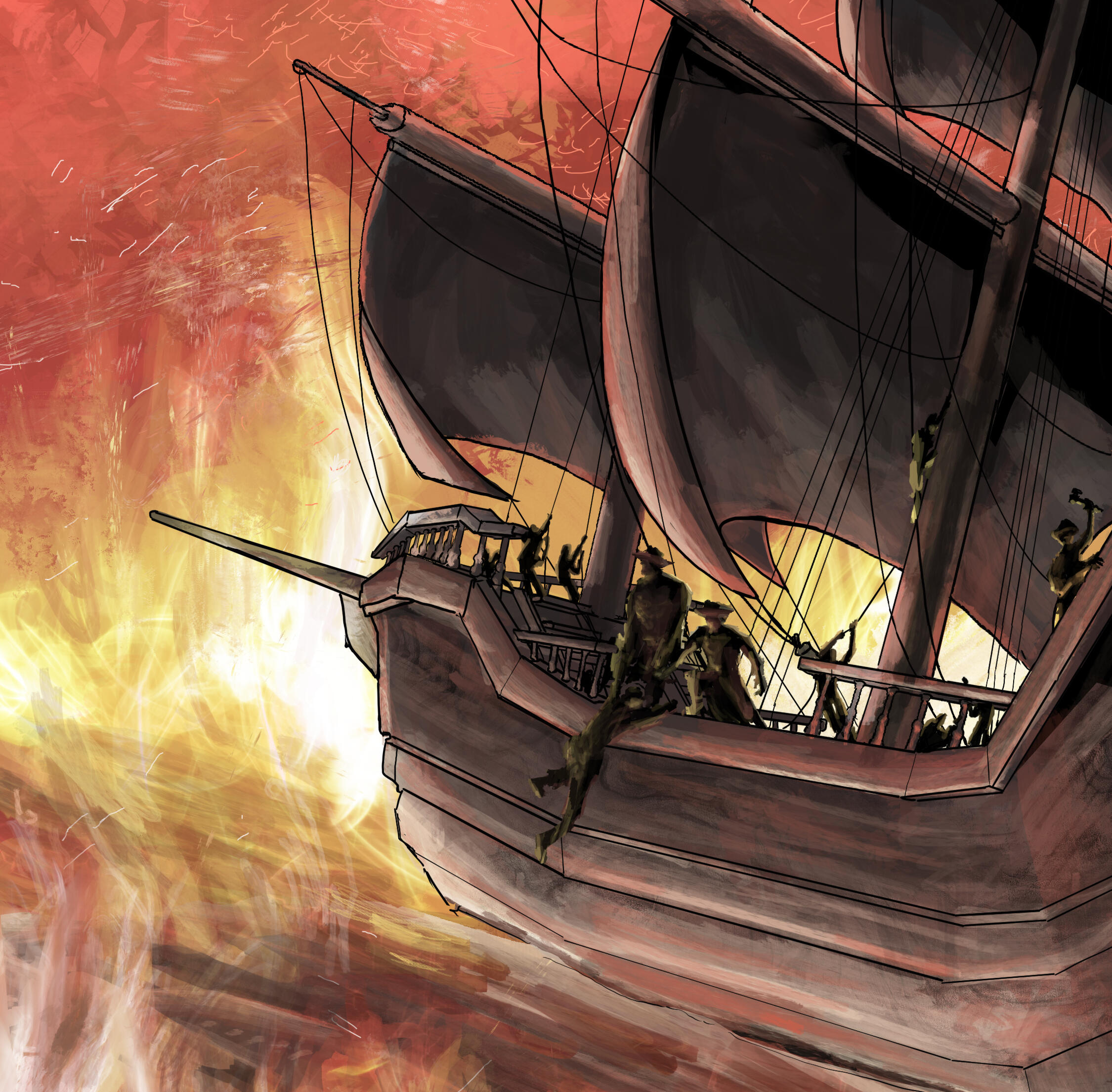
The picture to the right demonstrates examples of the Port and Plunder cards. They all follow the same format, with color coding and symbols to designate which "islands" the cards are from. While the art styles are unique to the artist that made them, they follow similar design principles, and they ultimately look very cohesive, proving the success of the art direction.
This was made possible due to the use of references and art bibles. We created a large art bible with various references, including the ones mentioned above. Our artists were able to utilize this art bible to better suit their designs to the overall aesthetic of the game. This allowed the card to maintain their artistic identity without looking too out of place.
NARRATIVE DESIGN
Implementing a narrative component to a physical board game is extremely difficult, but due to the interests of the team and the constraints of our assignment, I was able to make it happen. We ultimately decided on a story in which you, as a pirate, are exploring 4 different islands and fighting the monsters of that island.
One of the strongest elements of our narrative design was the lore document that we ended up creating. This document was initially meant to be for development purposes only, but we eventually decided to make it a deliverable piece of the game, so that players had the option to create an emergent story by reading up on the lore of each island. The lore document is linked below.
The narrative design of this project also required a lot of research to be done, both into the locations that we were creating and into the characters that were present on each island. Everything we wrote was inspired by something from real-life culture, and those inspirations helped make each island more rich and meaningful.
INDUSTRY MARKETING
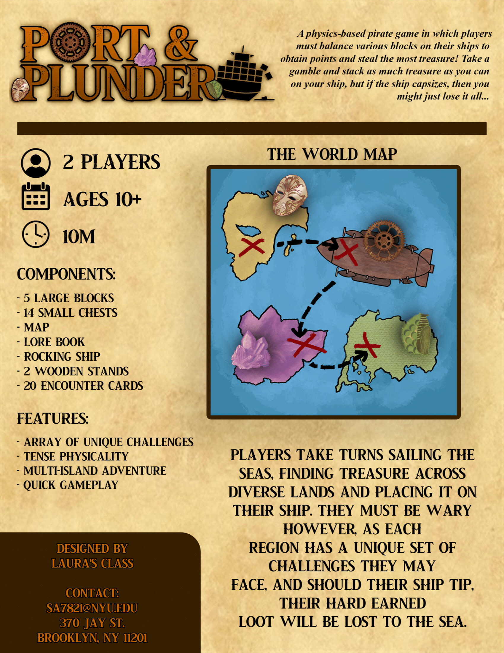
One of the biggest trials when making a board game was being able to sell it. While Port and Plunder is not physically available for purchase, we were still required to adopt the roles of salesmen, creating a sell sheet for the game in order to be published.
We were also given the opportunity to formally present Port and Plunder in a simulated professional environment. This exercise gave me experience working professionally and selling games to be published, which can easily transfer to working with real publishing companies down the line.
One of the most successful things about Port and Plunder was its marketability; we were required to pitch the game to the NYU Game Center's staff in order to have it included in the library, but the staff members immensely enjoyed our presentation, our speaking skills, and most importantly, the game itself.
Post-Mortem
Successes
★ Ultimately, our initial concept was realized, and we achieved all of our baseline design goals when creating the game. Our final product was very semblant of the initial sketches that we went into the design process with, and we did not have to compromise on many things throughout the process, making the project feel successful to all the developers.
★We were successful in emulating a party game that included board-game elements while also implementing physical game activites. The cohesion between the two gameplay elements was a large task to undertake, but ultimately, the game felt very smooth when transitioning from the map to the 3D ship.
★ We were able to push our game through multiple playtesting iterations, receiving feedback from playtesters and iterating on their notes to improve our game overall.
★ Our pipeline resulted in the creation of a tangible product, when at times, there were concerns that we would not be able to have a product by the deadline.
Challenges
★ One glaring realization we had was that it was near-impossible to have the departments work completely separately. For example, the art team would have to wait for the narrative team to create lore, in order to create art for that lore. The production team did not know what game pieces were needed until the mechanics team fully finalized their idea. Issues like this popped up, and there could have been a better production pipeline in order to avoid confusion.
★ Certain cards weren't as well-balanced as others, causing some cards to feel obsolete or feel boring when put into play. Other cards broke the spirit of the game, to some degree, which inadvertently encouraged players to "cheat". Additionally, some vocabulary could have been made clearer, for player clarity.
★ Given our time limit, the project was over-scoped. There were also various issues with communication between the departments, causing certain production errors and confusions. Especially in the initial phases of production, various teams would go behind each others backs and do things, which I had to mitigate.
Improvements
★ I could have utilized the time we were allocated more efficiently. Rather than spending certain amounts of time in planning phases, it would have been more beneficial to prioritize physical production.
★ When designing the cards, each card could have been playtested more thoroughly. While we did playtest, our demographic wasn't wide enough, and when the game was exposed to certain demographics, they ended up taking advantage of certain unrealized aspects.
★ It would be beneficial to figure out how to get narrative and mechanical teams to work together. For this project, the narrative felt rather obsolete, and yet due to the constraints of the rubric, I was required to shoehorn in a narrative team regardless. This implementation could have been done better.
★ There could have been better physical production throughout the project. We were limited to using NYU's 3D printing services, which heavily stunted our production speed and made it difficult for our production team to make changes to their existing prints. Either outsourcing this production or finding better alternatives would be a good improvement.
4PM
This project was made as a final project for the Intro to Game Development class at the NYU Game Center. In this class, we were asked to create projects in GameMaker, in order to practice our production, coding, development, and collaboration abilities. I worked with two other students to make this project possible.Our project, titled 4PM, is an abstract fantasy that follows a main character who struggles with depression and mental instability, manifesting in the form of hallucinations. These hallucinations take over the main character's house, allowing for the player to engage in various minigames, interactions, and explorative moments. The game itself was inspired by a JSON text-parsing system, allowing for a game with multiple interactables that could be easily edited in backend development. The pitch for this game was heavily asset and dialogue-focused, and we used script documents and asset trackers to maintain progress.
MY RESPONSIBILITIES
★ Led and directed the production and development of the game.
★ Oversaw 4 department leads, in fields of Art, Mechanics, Production, and Narrative. Consistently took charge of the four department heads, coordinating their development.
★ Served as a liason between the four departments and our teacher, who assumed the role of a publisher in this project. De-escalated conflicts and alleviated confusion within the teams.
★ Developed the core idea around the game, based on an initial pitch from a team member, to better fit the constraints of our budget, time, and assignment.
★ Utilized organizational tools like G-Suite and Trello to ensure smooth progression within each of the 4 main teams.
★ Provided assistance towards the narrative direction and art direction, making necessary adjustments to ensure that no teams were overlapping.
★ Took charge as our team's primary QA and playtester, developing multiple iterations of the game based on player feedback and advice.
★ Acted as a representative of the project to the NYU Game Center, advocating for the eventual publishing and housing of our game in the NYU Game Center Library.

"Eevee Expo" initially started as a video showcase, akin to Nintendo Directs or PlayStation State of Play presentations, showing off new indie RPGs and fangame projects. Our YouTube channel, linked above, houses these hour-long presentations, which we took the liberty of compiling, editing, and producing for RPG fans. These presentations also included technical interviews with developers and creators, providing viewers with deeper insight on the development process. I was a host, scriptwriter, and editor for these presentations, and still am to this day.
Eevee Expo has since evolved, and is now a full forum website for indie RPGs and games, similar to Itch.io. I am a site moderator and Discord moderator for the modern Eevee Expo. We still continue to hold presentations, but they are held as part of a larger conglomerate with Eevee Expo overall. We also post regular newspapers, hold interviews, host game jams, and more.
Slice of Life
"Slice of Life" is an animated short film that I produced, edited, and sound designed. This film was created in collaboration with New York University's Student Animation League, in 48 hours. The film follows a girl on Chinese New Year, who contemplates her potential future while peeling mandarin oranges. "Slice of Life" was submitted to NYU's T48 Film Festival in 2024. The film won awards for Best Screenplay, Best Sound, Best Director, Audience Choice, and Best Picture. The team size for this project was ~15, and all collaborators were students at New York University. My specific contributions are detailed below.
MY RESPONSIBILITIES
★ Executive-produced the film and oversaw the production pipeline for multiple artists, writers, and animators.
★ Edited the final cut of the film in Adobe Premiere Pro.
★ Communicated with the competition organizers to coordinate between the competition rules and my team's film.
★ Supported the project's production through the use of G-Suite and Miro to organize references, coordinate story ideas, and finalize scripts.
★ Sound-designed the film using Pro Tools and industry-grade equipment, courtesy of NYU Tisch.
★ Outsourced work to external members, such as voice actors, guest animators, and producers.
★ Assisted in the narrative design and development of the film, creating storyboards, organizing story beats, and planning the overall plot.
★ Assisted the director in coordinating the art and sound direction of the film, supporting his creative vision while also allowing for artistic expression of the animators' visions.
POST-MORTEM
Successes
★ We were able to completely tell our story without cutting any corners, which was a massive success. We made proper use of the film festival's given constraints, and we were able to work within our time limit to create a finished and polished product.
★ We were successful in ensuring that every artist's style and creativity would not be compromised. We came up with a creative solution to explain stylistic differences: Each art style represented a different "future universe" for the main character, demonstrating the branching possibilities of her life.
★ Within the T48 festival itself, we were able to win multiple awards, including ones commending our sound design, direction, and overall quality.
★ There were minimal errors in production, and everything consistently moved forward. There was never a need to backtrack or redo any previous team member's work, and everyone had ample inclusion the film production and creation overall.
Challenges
★ We were undeniably in a consistent time crunch. The film festival was intended for live-action film, and so making an animated film was very difficult and not intended to be done within the time constraints. It required a lot of talent and a lot of outsourcing, making the overall process more difficult and tedious.
★ Due to the short-term nature of the film festival, a lot of our team members had to bow out due to prior commitments. This required a lot of quick thinking from the production team in order to re-allocate tasks and ensure that we would be able to achieve our production goals without putting too much strain on the artists. We had to re-design some storyboards and re-configure certain shots in order to keep the overall production on track.
★ There was slight overscope in our initial idea, as we weren't able to properly account for how much work our animators could get done in the allocated time. This required some narrative adjustments and workarounds, but ultimately did not impact the production in any major way.
Improvements
★ Due to the constraints of an animated project, there were certain things that could have been scoped properly. For example, we could have given ourselves more time to focus on the production phases of our film, rather than rushing straight into post-production.
★ Because of our limited time frame, we struggled a lot to get editing done. While we had initially set a timeline for ourselves to have ample time to edit the film, these deadlines had to be pushed back due to various circumstances. We could have followed our timeline more strictly and held ourselves accountable, instead of cramming an editing session at the end.
★ We could've done a better job at finding a consistent style. While our workaround was efficient, it probably would have been easier and more practical to find a cohesive art style for all animators to follow, in order to create a more collective project and demonstrate our abilities better. While the varied art styles were impactful, a consistent art style would have allowed us to tell our story better.
